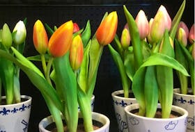
Over the years producing my TV shows and decorating my own homes, it’s safe to say that I’ve played with the entire colour spectrum. I painted towering two-storey walls in pistachio, a dated and boring kitchen was revived with bright orange cabinets, lavender and purple ruled for a teen’s room, garden greens made a welcome kitchen and pantry, a Victorian dining room glowed in red paint and paper ... on it went, and on it still goes. The homeowners and I were mostly happy with the adventurous choices. A colour duo that I return to often when I am looking for a calming ambience is blue and white. It never fails.
The author of Blue & White and Other Stories is of the same mind. William Yeoward is a style maker, designer and retailer who has built his auspicious career championing the timeless duo in its many shades. Yeoward says, “Blue and white are colours that go beyond fashion. They are part of all human experience — blue sky, blue ocean, white clouds, blue jeans, white shirts.” Combining these colours in your home provides differing scenarios, from crisp and graphic to spiritual, peaceful and calming.
We often think of the dining room as the place to eat only evening meals when it’s dark outside. But Yeoward notes that lunch and summer suppers need a room that is uplifting and makes the most of daylight. Shown here, the room’s Georgian architectural details, including deep baseboards and shutter cases, are painted off-white for emphasis. Introducing a modern element or two, the walls are clad in a blue and white paper-backed linen fabric printed with a graphic depiction of ripples in sand. The predominantly white rug design inspired by clouds has edgy blue and white dots and squiggles.
“It’s totally irresponsible to have uncomfortable dining chairs,” states the designer. (This is a good point, and I’m guessing that wood chairs and benches often used in more minimal schemes wouldn’t be acceptable.) Yeoward’s dining chairs are “supremely comfortable.” They are a traditional design with turned legs in the front and simple ones at the back. The upholstery design is inspired by rock striations. Quirky white ceramic vases on the table and antique galvanized buckets on side tables are personal touches that add humour.
Yeoward has other colour stories to tell in his book. Red and orange have heat and energy, lots of vitality he carefully inserts into woody and neutral schemes. These vibrant shades appear in cushion fabric, carpet designs and floral displays, but never overpower.
Ochre and green are country colours with universal rustic appeal. Taken directly from nature, they can be as subtle or as brilliant as you choose, but quiet is the trend here, making a perfect backdrop for collectibles and antiques found at a country fair.
Bridging the gap between then and now, compelling shades of pink and grey can feel both ancient and new. Grey is a subtle neutral that gives just the right balance to pinks that are either pale or vibrant.
Debbie Travis’ House to Home column is produced by Debbie Travis and Barbara Dingle.